7 Essential Elements for Eye-Catching Podcast Cover Art in 2024
Striking color combinations for visual impact
The colors you select for your podcast cover art are key to making a visual statement. Color choices can evoke emotions and instantly grab a listener's attention, helping create a strong and memorable identity for your podcast. Consider pairings that subtly influence how your podcast is perceived. For instance, the combination of Pale Lilac and Lime Green can project a youthful and vibrant feel, while the contrast of Urban Brown and Blue can lend a sense of grounding and sophistication due to the interplay of warm and cool tones. The power of color is not limited to just aesthetic appeal. It can actually communicate the spirit and content of your podcast. Don't be afraid to experiment and try out different color palettes to find one that best represents your show's personality. By carefully considering color combinations, you can make your podcast cover art memorable and ensure it stands out among the many podcasts competing for attention.
The way colors are arranged in a design significantly influences how people perceive and react to it. For example, some studies have suggested that pairing pale lilac and lime green can evoke a feeling of vitality and youthful energy. It's interesting to think how these color choices can tap into viewers' subconscious and create certain associations.
The combination of urban brown and blue is often seen in branding. It seems that the contrast between warmer, earthy tones and cool, calming blue tones can be really effective for creating a memorable design. This contrast is thought to create a more robust visual impact.
We've observed that podcast cover art needs to establish a unique identity—it needs to effectively function as a brand symbol for the podcast itself.
High-resolution images are important, which is why we recommend dimensions in the 1400x1400 to 3000x3000 pixel range. Maintaining a 1:1 aspect ratio ensures that cover art displays well across the various podcast platforms, especially as we've seen a significant portion of listeners accessing content from their mobile devices.
From a visual perspective, simplicity reigns supreme. High contrast visuals, along with avoiding excessive text or a multitude of different fonts, can contribute to more pleasing designs.
In a world where smartphones are ubiquitous and approximately 73% of podcast listening happens on those devices, podcasts need to optimize their cover art for mobile screens. This implies that design choices should factor in a mobile-first mindset.
Ultimately, a successful podcast cover art piece combines visual clarity, intelligent color selection, and the ability to visually represent the podcast's unique subject or thematic focus.
It appears that experimenting with and understanding color theory is a continual process. With that in mind, exploring different color pairings and applying the concepts of color theory is key to creating eye-catching visuals that make a strong lasting impression. There are some excellent examples out there; for instance, the visual approach taken on podcasts like "99 Invisible" and "How to Keep Time" appear to be quite effective. They effectively tell a story in their visuals and remain highly visually appealing.
Legible typography with sans serif fonts
When designing podcast cover art, clear and easy-to-read typography is crucial, especially when using sans serif fonts. These fonts, with their simple, modern style, contribute to a clean and accessible look. This is increasingly important in a world where a large portion of podcast listening occurs on mobile devices, demanding easy-to-read text at various sizes.
Choosing the right sans serif font can greatly enhance the overall presentation of your podcast's cover art. Options like Arial or fonts specifically designed for clarity, like Aurora Grotesk, are examples of how to optimize readability. It's essential to select a font that avoids intricate flourishes and decorative elements, which can sometimes hinder readability and diminish the overall impact of the design. A clean and concise font choice makes the title and any important information easier to absorb at a glance.
Ultimately, well-chosen fonts can transform a podcast cover into a professional and attention-grabbing piece of art. By carefully selecting legible sans serif fonts and applying them in a thoughtful manner, you can contribute to a polished and impactful brand identity for your podcast, making it more likely to attract and resonate with a wider audience.
When it comes to podcast cover art, especially in the context of mobile viewing, legibility is paramount. Sans serif fonts, with their clean lines and lack of embellishments, seem to be a natural choice. Researchers have found that our eyes can process them more efficiently, especially on smaller screens where speed is key to keeping listeners engaged. This characteristic is important in the crowded podcast market, where initial impressions matter.
Furthermore, studies suggest that sans serif fonts hold up better than serif fonts when scaled down. This is beneficial because podcast cover art frequently needs to fit into relatively small spaces on platforms like mobile device screens or social media. The ability to retain clarity at smaller sizes makes them ideal for showcasing information efficiently.
Interestingly, a significant portion of digital readers express a preference for sans serif fonts. It seems they're often associated with a modern and uncluttered aesthetic. This preference could influence a listener's first impression of a podcast's visual branding, suggesting that thoughtful font choices can contribute to a more positive reception.
The inherent simplicity of sans serif typography might contribute to reduced cognitive load. Essentially, by reducing visual complexity, the design allows the listener to focus on the podcast's content itself, rather than being distracted by intricate font details. In a competitive environment with a vast number of podcasts available, this ability to focus on the core message is a valuable asset.
However, not all sans serif fonts are created equal. The weight of the font can influence how it's perceived. For example, a bold sans serif typeface often appears more authoritative and impactful compared to a lighter style. This characteristic allows podcast creators to communicate a brand’s core message more assertively in their cover art.
We've also noticed that sans serif fonts often tend to be easier to read against imagery or colored backgrounds, especially if there's strong color contrast. Their straightforward form makes them a good choice for designs incorporating elements like textures or backgrounds without sacrificing readability.
It's important to acknowledge that cultural factors can influence how sans serif fonts are perceived. While they are frequently linked with innovation and technology in the West, the same might not necessarily be true in other parts of the world. Podcast creators might need to consider these cultural nuances to ensure that the font choices are consistent with the overall brand message they wish to portray.
Whitespace around the font itself is also a factor. Effectively using this empty space can highlight the text and create a more visually appealing design. Conversely, cluttered designs often have the opposite effect, especially in the compact spaces found on podcast covers.
Perhaps due to their simplified construction, sans serif fonts tend to display well across different screen sizes and resolutions. This versatility is advantageous for podcast cover art that will likely be viewed across many platforms, ensuring visual consistency.
Lastly, the clean and uncluttered nature of sans serif fonts might contribute to a more relaxing and welcoming mood, fostering a positive first impression for potential listeners who discover the podcast through the cover art. It's interesting to think how these subtle visual choices can impact a viewer's perception and ultimately influence whether they choose to listen or not.
Minimalist design approach with limited text
A minimalist design approach for podcast cover art favors simplicity and clear communication, often using very little text to get its message across effectively. This style emphasizes visual clarity, making the artwork easily understood, especially on smaller screens commonly used for listening. By keeping the design uncluttered and focusing on key elements like high-quality visuals and strategic typography, podcast creators can create a strong visual identity that accurately represents their show. In the competitive podcast landscape, a minimalist approach helps cover art stand out, making the podcast instantly recognizable and establishing a distinct brand. Ultimately, minimalism not only improves the visual appeal but also helps build a more genuine connection with the intended listeners.
Minimalist design, when applied to podcast cover art, hinges on brevity and clarity, often employing limited text to effectively convey powerful messages. This approach isn't just about aesthetics; it appears to have a strong impact on how people engage with the artwork.
For example, the reduction in visual details seems to reduce what's called "cognitive load," the mental effort required to understand something. In a world saturated with visual stimuli, keeping things simple allows viewers to quickly grasp the core message without feeling mentally overwhelmed.
This concept also extends to visual hierarchy. With fewer elements vying for attention, the design can more successfully guide a viewer's eyes towards the key components. Studies suggest that this can improve the chances of information sticking in viewers' minds compared to designs with lots of different elements.
Further, minimalist designs are frequently associated with better brand recall. There's some evidence that this simpler style can make it easier for people to quickly recognize a brand, which could translate into a higher likelihood of listeners remembering and associating the podcast cover with the show itself.
It's fascinating to note that how people perceive minimalist designs can be influenced by cultural context. Research suggests that the minimalist style's association with sophistication or modernity in the West may differ from how it's interpreted in some Eastern cultures. There's a potential link to cultural values—for instance, minimalism could be perceived as representing concepts like harmony and balance in some Eastern traditions.
However, minimalism isn't just about looking good. There's also the intriguing element of speed. Data suggests that users can process minimal visuals much faster than more complex ones, possibly making a difference in whether someone decides to listen to a podcast within those fleeting seconds of encountering its cover. It's almost as if the simple design speeds up decision-making in a context where quick choices are the norm.
Minimalist design can also lead to a heightened sense of intrigue. When less information is presented upfront, it appears to create more curiosity about the podcast's content. This notion suggests a possible link between simplified visual communication and the urge to learn more, potentially nudging potential listeners towards exploring the show further.
There's a growing interest in accessibility considerations in design, and minimalist aesthetics seems to have an edge in this area. The clearer visual communication and reduced clutter found in minimalist designs may be easier for individuals with certain learning differences, such as dyslexia, to understand compared to more complex, text-heavy artwork.
Visuals themselves can be incredibly powerful. Data suggests that our brains can process images far faster than text. This highlights the potential benefit of leaning into visual communication when designing cover art. If podcasts are attempting to grab attention in a limited amount of time, images can help in this effort.
And finally, the longevity of minimalist trends should not be overlooked. Historical patterns suggest that people have consistently found this approach attractive across several decades, possibly indicating that this approach has a kind of timeless quality. This suggests that cover art designed with a minimalist approach might remain effective across various demographics and over time.
High-resolution images at 3000 x 3000 pixels
High-resolution images, specifically those with dimensions of 3000 x 3000 pixels, are crucial for creating impactful podcast cover art. This resolution is often the maximum supported by major podcast directories, ensuring your artwork looks its best across platforms. Since a significant number of listeners use mobile devices, this high resolution is especially important for clear and sharp visuals on smartphones and other screens. The 1:1 aspect ratio associated with this resolution further enhances visual appeal by maintaining consistent proportions across diverse platforms. It's important to note that blurry, low-quality images can negatively impact your podcast's professional image. A high-resolution image provides the visual clarity necessary for a strong brand identity within the competitive podcasting environment. By prioritizing high-quality visuals, you're establishing a foundation for a podcast that is more likely to attract and retain listeners.
Using high-resolution images at 3000 x 3000 pixels offers several advantages for podcast cover art. Firstly, the high pixel density (around 300 pixels per inch) ensures crisp visuals, even when viewed closely on devices like phones. This high clarity can make a notable difference in how a listener perceives the overall quality of a podcast.
While the standard is a square aspect ratio (1:1), it’s also versatile in that it can be readily adapted to various platforms without major loss of quality. This flexibility helps designers create a consistent look across social media, podcast directories, and other media without compromising the design’s intent.
Research suggests that high-resolution imagery can make it easier for the brain to process information. The enhanced visual clarity might contribute to better retention of information, potentially leading to increased engagement and perhaps even better recall of the podcast among listeners.
However, this benefit isn't without potential trade-offs. The larger file sizes can necessitate careful compression techniques. Engineers have to find that sweet spot where image quality is maintained while also keeping file sizes down, which is important for ensuring a fast loading experience.
Using high resolution can also lead to a more expansive range of colors in the cover art. This can be helpful in achieving a specific tone or feeling through color, which is a vital element of branding.
The ability to scale down a high-resolution image without significant loss of quality is important. Many listeners encounter cover art at various sizes, depending on the platform they use. Being able to maintain visual clarity is key to creating a cohesive brand experience regardless of the device or screen.
Furthermore, high-resolution images can be a powerful way to communicate the essence of a podcast. The clarity of the visuals can make the podcast more memorable and might reinforce the quality and branding elements of the podcast.
These sharper images also allow for a more nuanced control over the design. It allows designers to strategically place elements, which can guide the viewer’s attention toward things like the title or key visuals.
It’s fascinating to see how high-resolution images can create a connection to the perceived quality of a podcast. Listeners might subconsciously link high-resolution visuals with a perception of quality and expertise.
As digital media evolves, features like zoom or interactive elements are becoming more common. High-resolution images are well suited to such interactivity. This kind of engagement allows listeners to more deeply explore the artwork and potentially uncover elements which might encourage deeper understanding of the podcast's themes.
In summary, while podcast platforms do have minimum size requirements, exploring high-resolution options for podcast cover art appears to provide distinct advantages for designers and creators. The sharper visuals, versatile formatting, and potential for deeper interactivity suggest that this is an area worth paying attention to in today's podcast landscape.
Consistent branding elements across episodes
Maintaining consistent branding elements across your podcast's episodes is essential for building a strong and recognizable identity. This consistency includes using the same color palette, font styles, and logo across all episodes and promotional materials. This unified approach creates a coherent brand image, allowing listeners to easily associate specific elements with your podcast. It's generally a good idea to stick to a limited number of fonts to avoid visual clutter. Furthermore, it's crucial to ensure your episode images follow the same branding guidelines used in your main podcast art. A well-designed template can be an excellent tool for distinguishing different episodes while preserving the overall look and feel of the show. By prioritizing visual consistency across your entire podcast, you can strengthen the listener's connection with your brand and improve overall memorability.
Maintaining the same design elements—like color schemes, fonts, and logos—across all your podcast episodes and any promotional materials is essential for creating a unified brand identity. It's about making sure your podcast has a consistent visual style that people recognize.
Ideally, you want to limit yourself to using no more than two different font styles and sizes on your podcast cover art. Too many fonts can make things look cluttered and confusing.
Keep the text on your cover art concise. Focus on the podcast's name and, if it's helpful, a short subtitle. Any more text might make things seem crowded.
Essentially, simplicity, good typography, and relevant visuals are all key ingredients for creating a podcast cover that grabs attention and appeals to your intended audience.
One helpful tactic is to create a design template for your podcast episodes. This can help you create unique episode images while maintaining consistency with your overall podcast branding. This uniformity can provide a strong sense of recognition and brand personality.
It's still recommended to have 3000 x 3000 pixel images for podcast cover art to ensure high-quality visuals across various platforms, especially as a large percentage of podcast listening takes place on phones. This is a practical decision as a good visual presentation matters.
Making sure your podcast cover art looks good on smaller screens is crucial since a large chunk of listeners are on mobile devices. So, designing with this in mind is important to keep your audience engaged.
Tools like Adobe Creative Cloud Express or Canva can be helpful for crafting visually appealing logos and podcast cover art. There are several things that can be improved with design tools in this area.
It's a good idea to avoid overdoing it with visual effects and filters on your cover art. It can lead to an amateur or overly busy appearance.
Successful podcast branding is about understanding your podcast's topic, who your audience is, what makes your podcast unique, your visual design choices, and your core values as a podcast host. This is where having a consistent aesthetic across all episodes will come into play in generating interest.
Original artwork avoiding stock photos
When crafting podcast cover art, creating original artwork instead of relying on stock photos is a vital step toward establishing a unique visual identity. By developing custom illustrations or designs, podcasts can avoid the generic appearance that comes with widely used stock imagery, giving them a more personalized and memorable look. Original art allows for a closer alignment with the podcast's themes and emotional tone, helping to create a deeper connection with listeners. Original artwork also paves the way for a cohesive visual brand across various episodes and promotional materials. This consistent look strengthens a podcast’s recognition and draws in a more devoted listener base. Investing in original artwork is a clear sign of quality and shows a commitment to the podcast's success. It's a crucial element in building a strong visual presence within the crowded podcasting landscape.
When crafting podcast cover art in 2024, it's becoming increasingly apparent that using original artwork instead of readily available stock photos is advantageous. This approach offers a unique opportunity to differentiate a podcast within the expanding podcast landscape.
One of the key reasons to opt for original art is the inherent sense of authenticity it conveys. When listeners see unique visuals, it often instills a sense of trust and connection with the individual creator or podcast team. Generic stock photos, on the other hand, can feel impersonal and sometimes even diminish the perceived authenticity of a podcast. This is primarily because those images can be found and used by numerous other podcasts, resulting in a lack of visual distinctiveness.
It seems that the human brain is wired to favor unique visuals. Our minds tend to recognize and process original artwork more quickly and easily than generic or repetitive stock photos. This ability to form a quick mental connection to a unique visual can significantly improve a listener's recall of the podcast. It's quite interesting to consider how a simple visual element can influence a listener's ability to remember and associate a podcast with its cover art.
The use of original illustrations has been observed to lead to greater visual engagement. It’s possible that viewers’ eyes are more easily drawn in and captivated by artwork designed specifically for a podcast, compared to standard, frequently used stock photographs. This observation suggests a potential avenue for increasing audience interaction and capturing attention within the crowded podcast space.
Furthermore, original artwork provides the opportunity to carefully align visual elements with a podcast's specific themes and messages. Stock imagery, being largely generic, often doesn't quite capture the nuances of a particular show's content as effectively. When visual cues closely match the podcast's focus, it facilitates the communication of complex concepts and undertones that might be harder to convey using pre-made images.
Using original artwork tends to elevate the perceived quality and value of a podcast. This perception of increased professionalism can have positive ripple effects on listener engagement, as well as possibly lead to better opportunities for sponsorships or partnerships. It’s plausible that the presence of original art enhances how the podcast is viewed within the industry.
It’s interesting that original artwork provides a space for integrating elements of culture and identity specific to a podcast’s intended audience. This is a significantly harder task to achieve when relying solely on generic stock photos, which rarely include such nuanced cultural components. When creating custom artwork, podcasters can incorporate aspects of their target demographic into the imagery, fostering deeper connections with listeners and solidifying the podcast's relevance within that specific community.
Original art allows podcasters to evoke a desired range of emotions that align with the podcast's overarching content and tone. Custom artwork can establish a much stronger connection with the audience due to the careful design process, while the emotional response often associated with stock images is far less pronounced. This suggests that original art can significantly improve the viewer's experience, enhancing their ability to form an emotional connection with the podcast's subject matter.
The use of custom artwork also helps to reduce the potential visual clutter that can occur with stock photos and busy backgrounds. This is important in establishing a clean, visually appealing design that directs a viewer’s attention to critical pieces of information.
Perhaps one of the most important advantages of utilizing original art is the opportunity to craft a distinct visual identity that helps a podcast stand out amongst competitors. Since many podcasts tend to use similar stock imagery, it’s harder for a podcast to establish a strong, unique aesthetic.
In conclusion, using original artwork for podcast cover art presents a distinct advantage in the competitive podcast environment. It offers a pathway to creating a more authentic, memorable, and relevant podcast experience for listeners. As podcasting continues to evolve, this focus on creating custom artwork seems poised to play an increasingly important role in attracting and retaining a loyal listening audience.
Square format optimized for various platforms
Using a square format for your podcast cover art is important because it works well on many different platforms. This ensures a consistent look whether it's on a phone, tablet, or computer. A good size is 1400 x 1400 pixels, but you can go up to 3000 x 3000 pixels for the best quality, especially for people listening on mobile devices. This consistency really helps with establishing a strong visual brand identity that sticks with people, creating a clear link between your podcast and its cover art. In today's podcast environment where there's a lot of competition, the ability to quickly adapt your design across all kinds of media is important. In other words, high-quality, square cover art isn't just about how it looks; it plays a big role in how visible your podcast is and how attractive it is to potential listeners.
### Square Format Optimized for Various Platforms
The square format, predominantly 1:1, has become increasingly common, not just in podcast cover art but across various social media and digital platforms. This format's popularity appears to stem from its visual appeal and ability to maintain a balanced aesthetic, possibly leading to enhanced viewer engagement. Interestingly, research indicates that people tend to find square shapes visually appealing, which may contribute to its widespread use.
Considering that a substantial portion of podcast consumption occurs on mobile devices—approximately 70% as of late 2024—the square format ensures podcast cover art displays optimally without distortion or unwanted cropping. It's worth noting that mobile screens frequently prioritize compact formats, making the square design a good choice to avoid losing important visual information within the artwork.
The adaptability of the square format isn't restricted to digital realms; it also translates well into print materials, such as business cards and promotional posters. This versatility allows podcasters to maintain a consistent brand image across a wider range of media, potentially increasing audience recognition and brand recall.
It's quite intriguing that some research suggests square formats can lead to faster cognitive processing. Essentially, this means listeners can more rapidly recognize and remember podcast cover art formatted this way, enhancing brand visibility and making it a potentially smart choice for creating lasting impressions.
Moreover, the square format inherently supports a well-balanced arrangement of visual elements. This balanced composition can greatly improve the overall presentation of the artwork, ensuring that key elements—like the podcast title or logo—are easily visible and capture attention in the initial moments of interaction.
Standardization around the square format by major podcast directories ensures that creators can maintain design consistency across platforms. This consistency promotes brand recognition and makes it easier for listeners to identify episodes from the same podcast series, reinforcing brand identity.
The increasing prevalence of the square format across social media platforms, like Instagram, allows for a more streamlined promotional strategy. Using the same artwork for both podcast directories and social media posts creates a cohesive visual experience, potentially maximizing a podcast's reach and increasing its exposure to new listeners.
There's also a relationship between the square format and color consistency across different platforms. Since colors can be rendered differently based on screen calibration and display technologies, the square format offers a more controlled environment for color selection, enabling podcasters to experiment with various combinations while ensuring optimal visibility.
Well-designed square formats frequently evoke positive emotions, potentially boosting the chance that listeners will not only notice but also engage with a podcast's content. It's interesting how emotionally engaging visuals might influence trust and loyalty, reinforcing the importance of carefully selected artwork.
Finally, the adaptability and inherent visual stability of the square format make it a relatively future-proof option for creators. Its ability to maintain relevance in the face of evolving visual trends makes it a potentially sound long-term investment for building a lasting brand identity within the podcast landscape.
More Posts from transcribethis.io:
- →Step-by-Step Guide Uploading Your Podcast to Apple Podcasts in 2024
- →Tokyo University of Arts Workshop Explores 3D Audio Capture Techniques for Solo Piano
- →Streamlining the Podcast Guest Experience Optimizing Intake Forms, Release Agreements, and Booking Processes
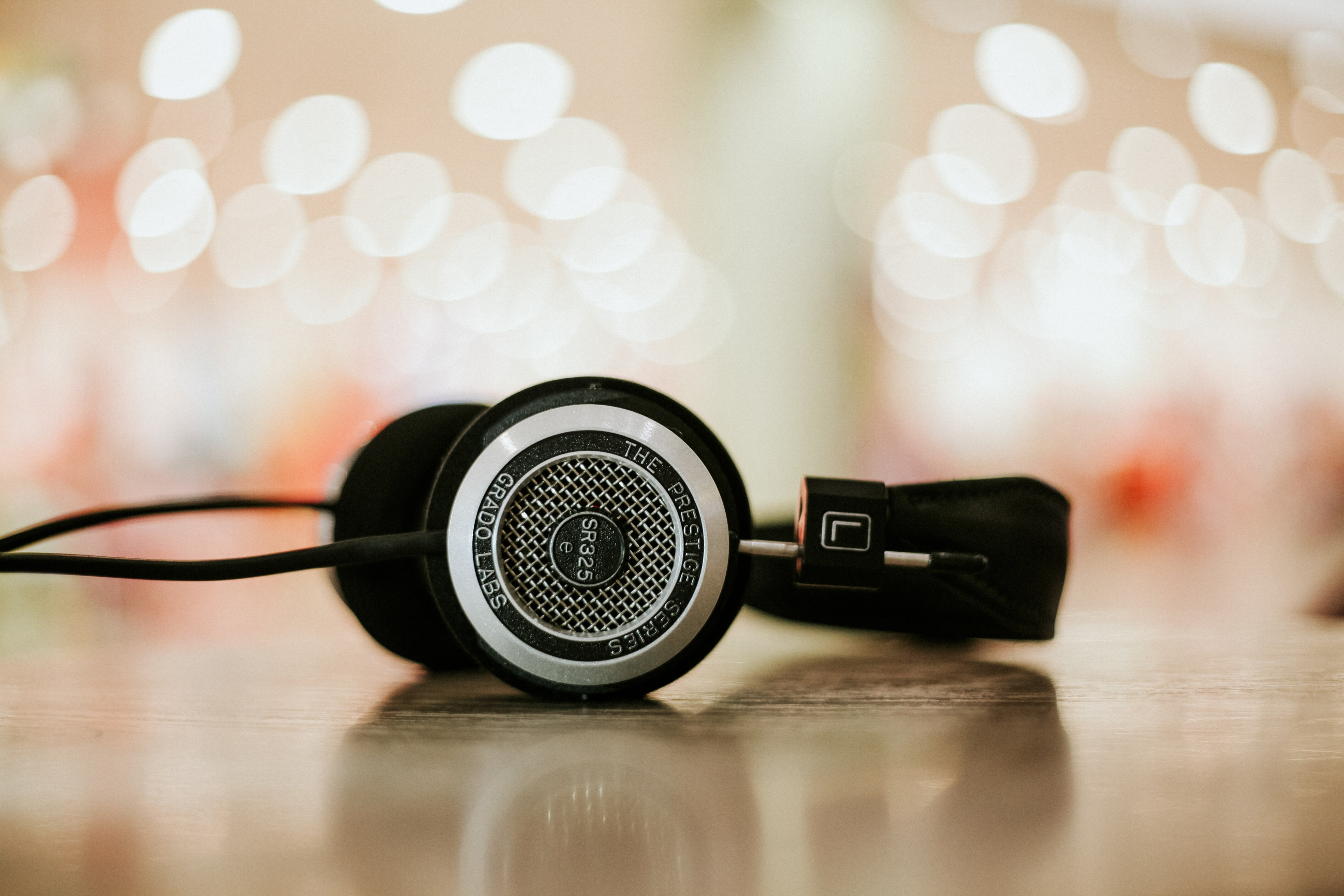
- →7 Essential Techniques for Mastering Audio with Headphones in 2024
- →Mastering the Art of Mono Compatibility 7 Practical Tips for Cohesive Mixes
- →Top 7 Audio Interfaces for High-Quality Home Recording in 2024